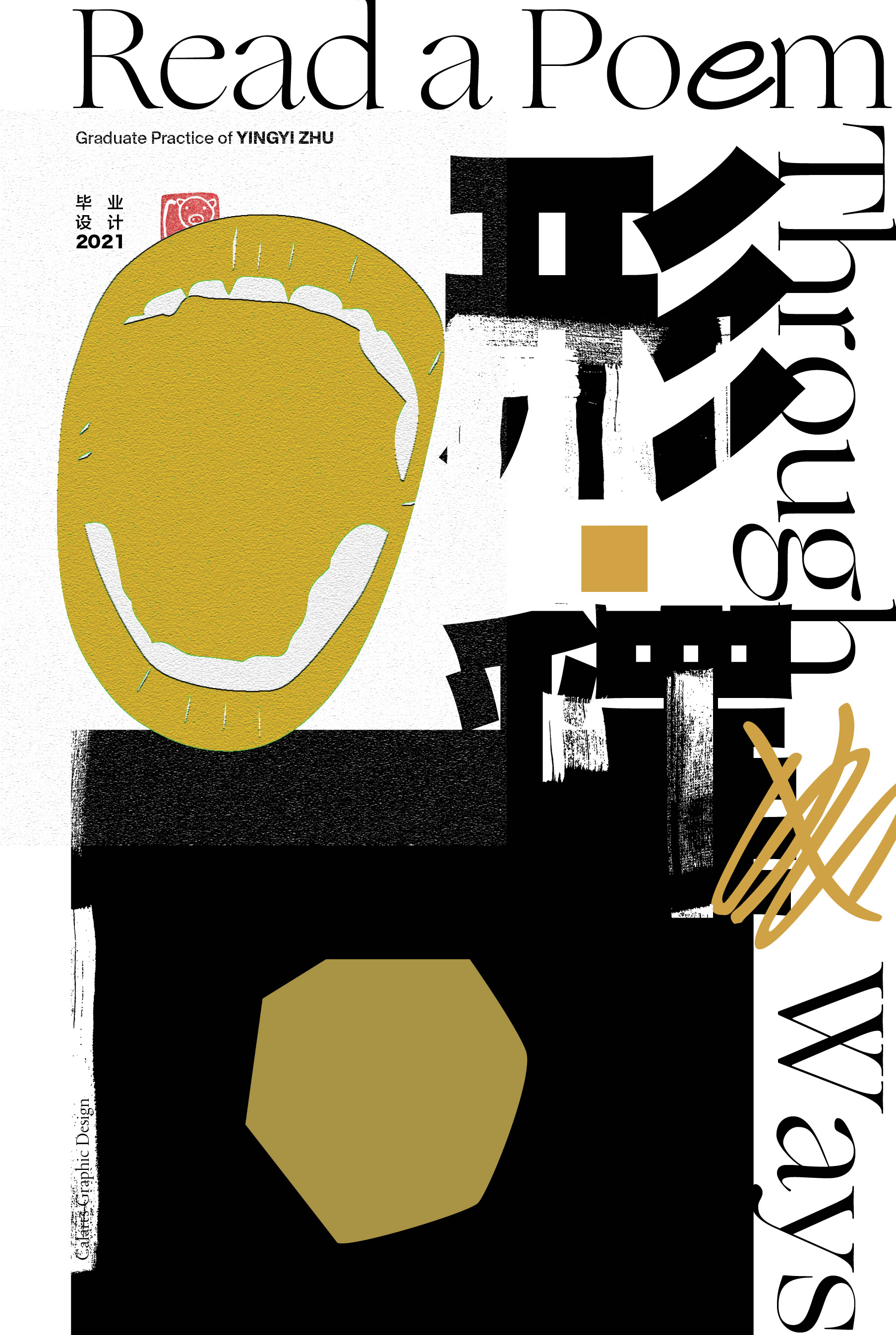
Work of / 2021
Chinese language has been used, spread, and communicated to more than one billion people in the world over the last 3,000 years. As a bilingual graphic designer with my own cultural position and identity, I would like to introduce cross-cultural audiences to Chinese culture, Chinese characters and language by showing them visualized literary works. By visually reproducing a specific bilingual poem as a starting point, this body of work dives into the study of Chinese characters, language, literature and their contextual background behind, rethinking the role of graphic designer as author and how to add graphic designer’s personal flavor and narratives into the work.
By applying Charles Sanders Peirce’s semiotic concepts as one of the methodologies to interpret the poetry with visual symbols and typographic connotation/denotation. The agenda of this practice is to discuss how to let the literary work be more easily accepted by the audience and to visually bridge the author and the readers together to make the reading more delightful while maximizing the imagistic possibilities.
The visual explorations are not limited to the poem itself, but visually explain some contextual background to the non-native speakers and provide ways to help them understand Hanzi and the Chinese language. Other than the traditional static typographic typesettings, the practice will also explore how to convey the meaning through the combinations of abstract forms, illustrations, 2D/3D motions, sound and music . All the processes of the exploration are compiled into a book.
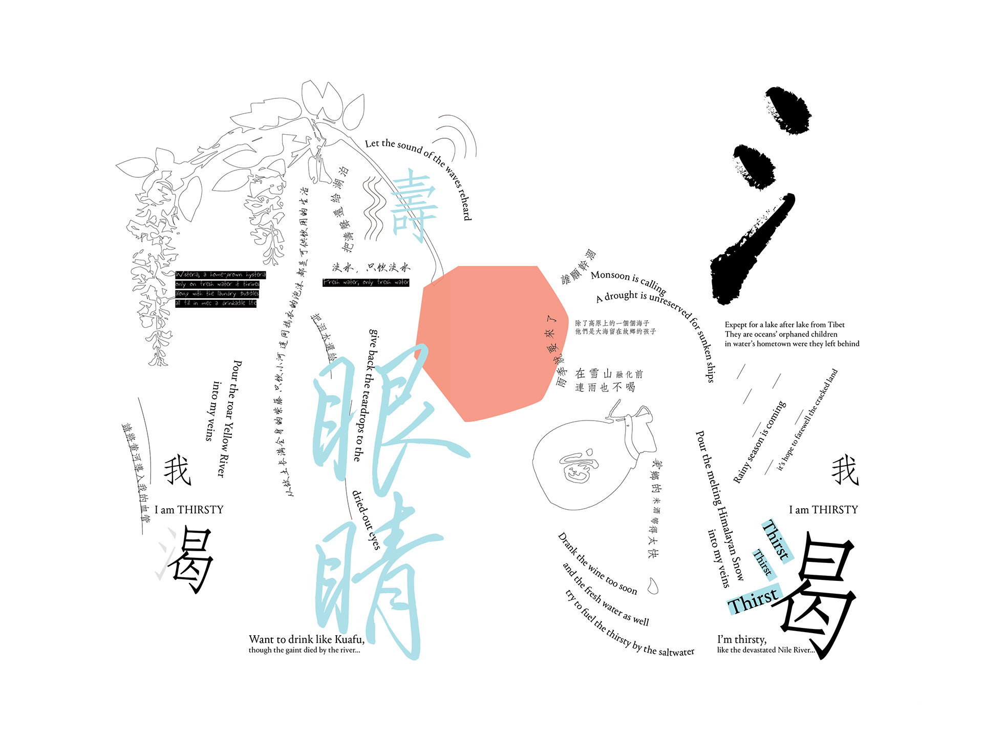
An experimental typographic form of a bilingual poem.
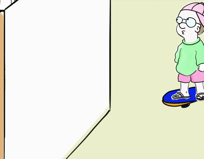
Kinetic Type
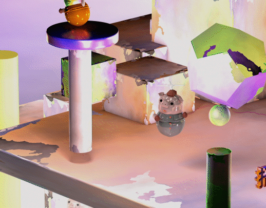
A set of illustrations made by Chinese character radicals. They tell a story about an ancient Chinese mythology of Giant Kuafu.
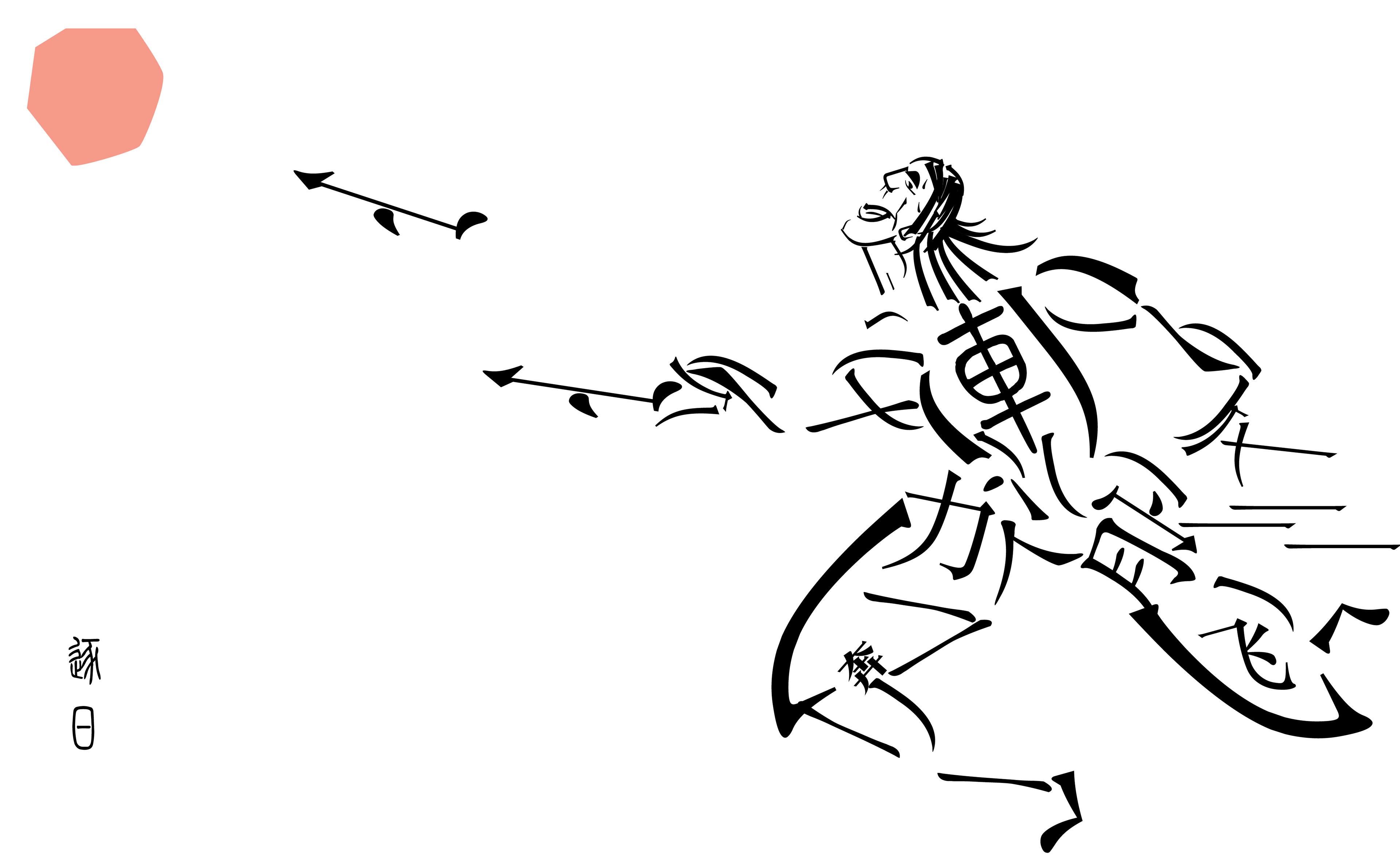
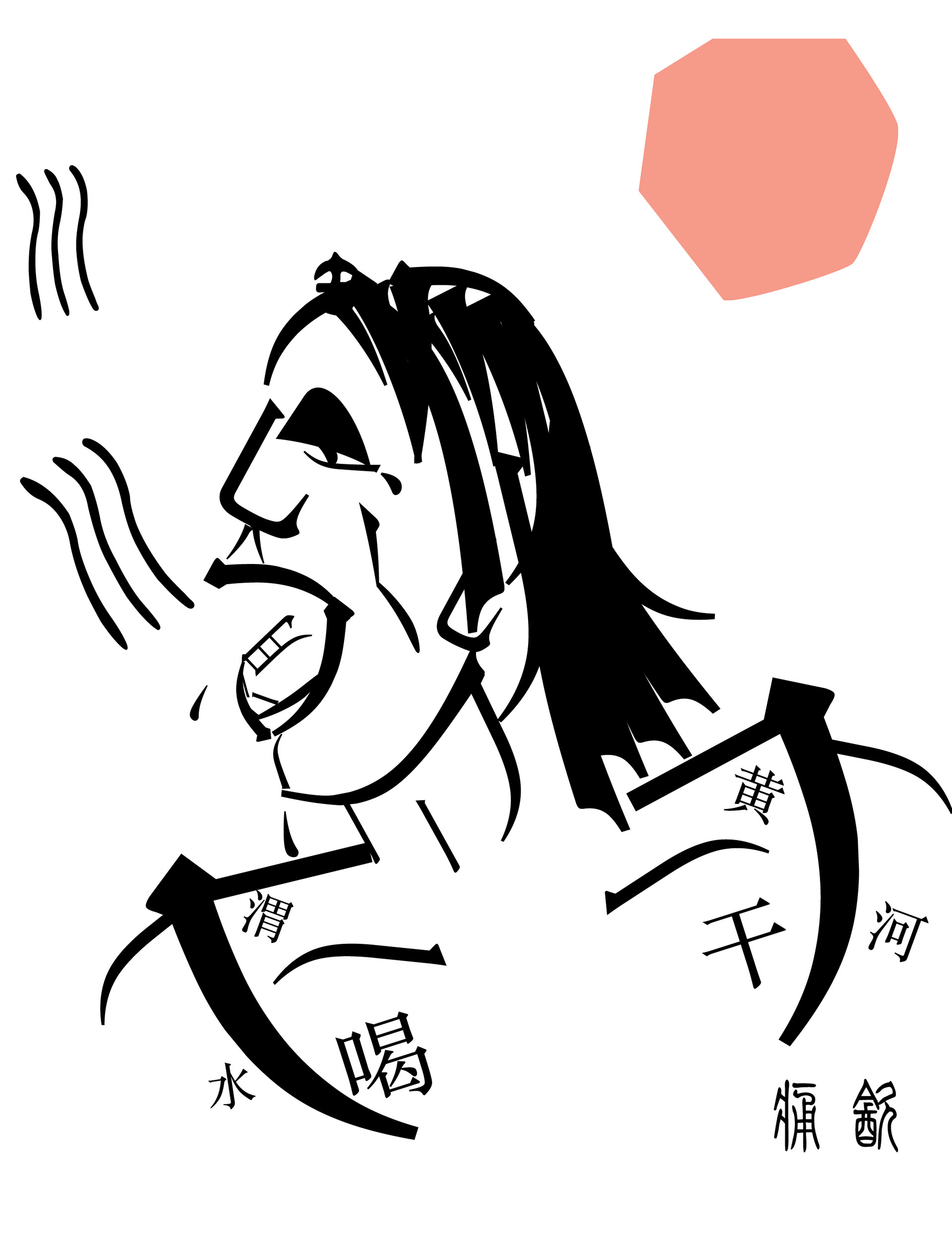
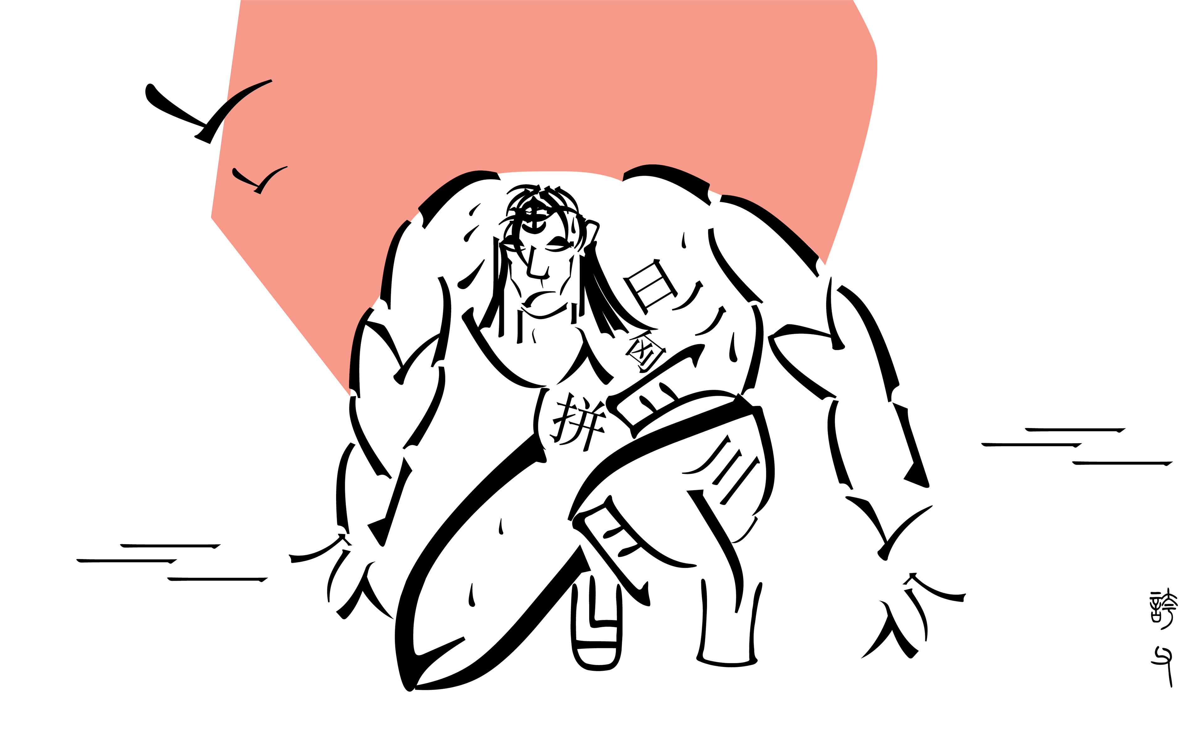
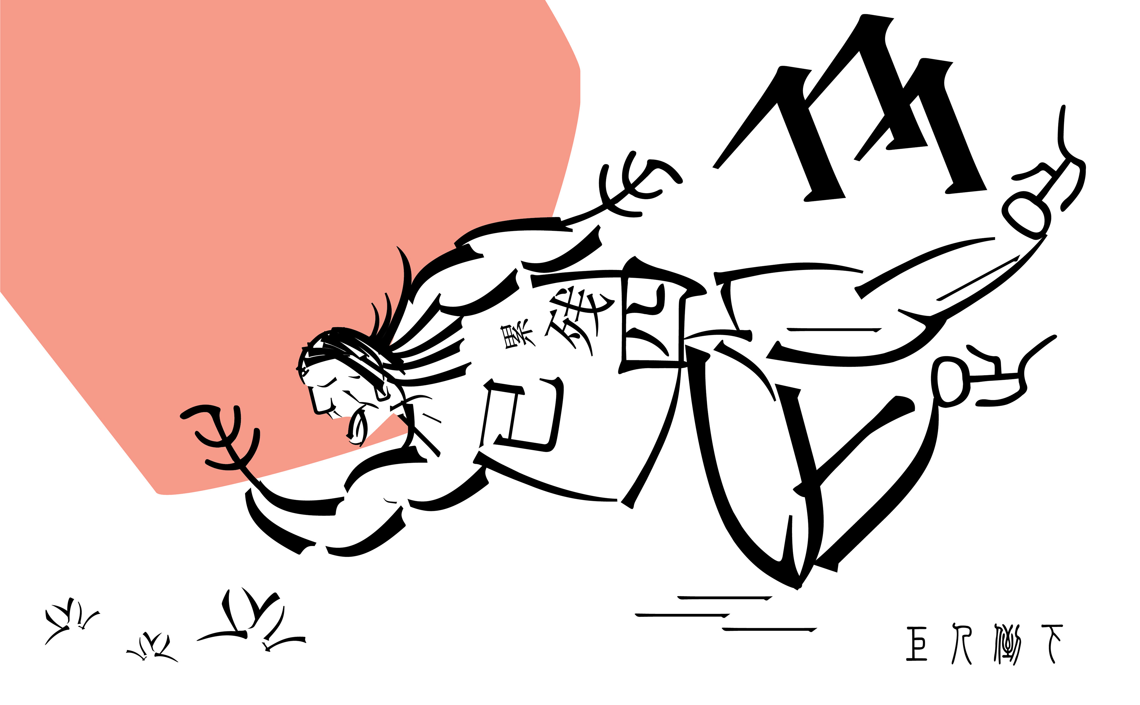
A semantic radical can give you hints of the meaning of the Chinese characters.
Guess the meaning through radicals